
Website teardown #1. How a product marketer would revamp wiz.io
Parry Gill · Nov 3, 2026 · 10 min read
Most website audits die in a slide deck. Someone takes forty screenshots, pastes them into slides with red circles, and presents it once. Two weeks later nobody remembers which circle was about what, and the site goes on saying the same thing.
So we're starting a weekly series. Each week I pick a well known site, audit it the way a product marketer would, and do the whole thing in Lasso so you can see every note on the real page. You get two things out of it. A way of thinking you can reuse on your own site, and a look at how the notes turn into an actual revamp plan instead of a deck.
First up is wiz.io. It's a strong site from a company most people in security know, which makes it a good test. Finding problems on a bad site is easy. Finding the next ten percent on a good one is the actual job.
A quick note before we start. Wiz didn't ask for this and isn't a Lasso customer. Everything below is from their public site as it looked on November 3, 2026. The screenshots come from a demo workspace, so Maya, Jordan, Priya and Sam are test accounts, not real people.
The five questions I ask of every page
Before clicking anything, it helps to know what you're looking for. I go through every page, top to bottom, with the same five questions.
- Who is this for? Can a visitor tell within ten seconds whether this page is talking to them? "Everyone" is not a buyer.
- What do they get? The outcome, in their words. Not the feature list, not the architecture.
- Why should they believe it? Is there proof sitting right next to the claim, or is it parked in a logo wall three scrolls away?
- Why this, and why now? What makes this different from the thing they already use, and does the category name help or confuse?
- What's the next step? Is there a path for every level of intent? Someone ready to buy, someone just curious, someone with a fire to put out.
Then two passes across the whole site. A consistency pass, where the positioning line, category name and plan names should match on every page. And a hygiene pass for typos, broken bits and anything a screen reader, Google or an AI search engine would read differently from a human.
If you want something to fill in as you go, here's the scoring sheet. Score each section 1 (missing), 2 (there but weak) or 3 (clear).
| Section | Who | What | Proof | Why us | Next step | Notes |
|---|---|---|---|---|---|---|
| Hero | ||||||
| Proof bar | ||||||
| Product story | ||||||
| Feature sections | ||||||
| Pricing | ||||||
| Final CTA |
The low scores are where the revamp starts. The notes column is the part that usually gets lost, and that's where Lasso comes in.
Setting up
I made one collection called "Wiz.io messaging revamp" and shared it with the team. If you're auditing alone, keep it private. Either way, every note lands in one place instead of a folder of screenshots.
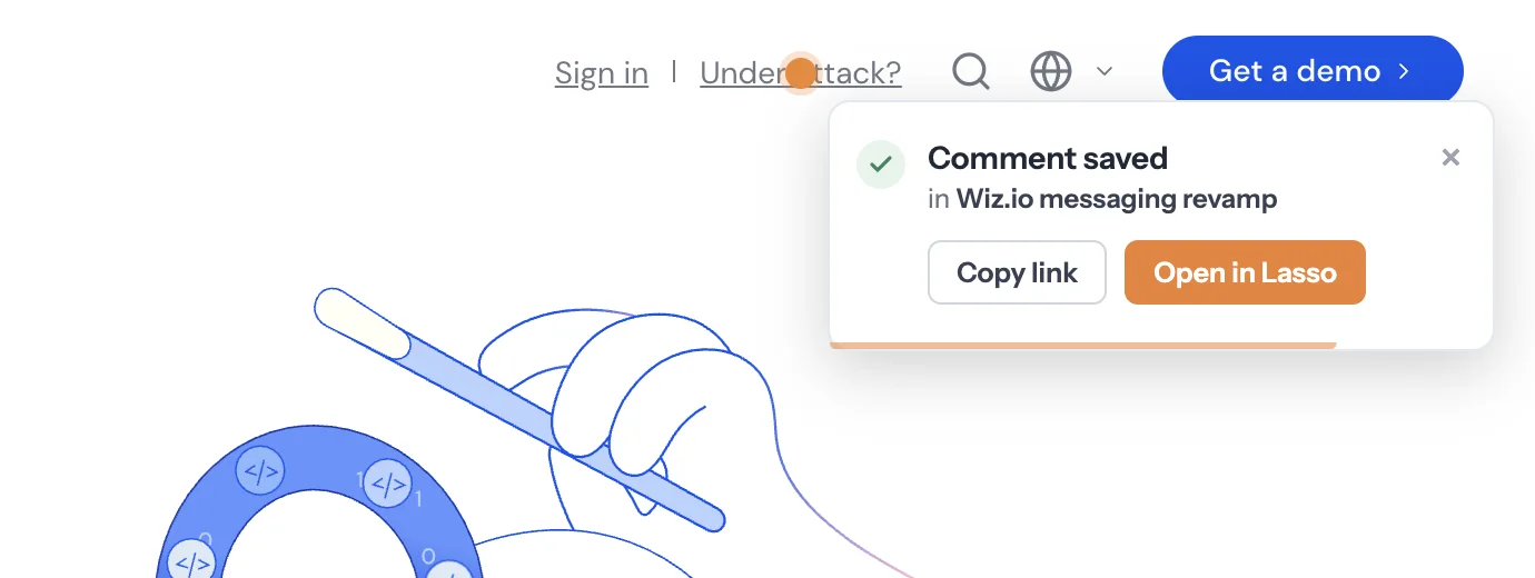
There's no board to set up, no tags and nothing to assign. Then I went to wiz.io and started clicking. Each click opens a comment box right next to the thing you clicked, and Lasso takes the screenshot for you, so the note always shows what the page looked like when you wrote it.
The first ten seconds
The hero is where most of the value is, so it got the most attention.
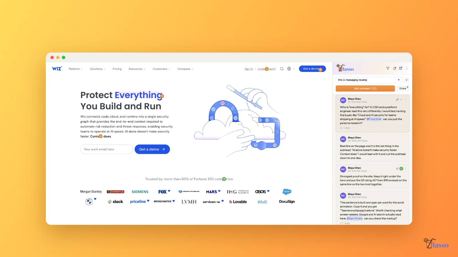
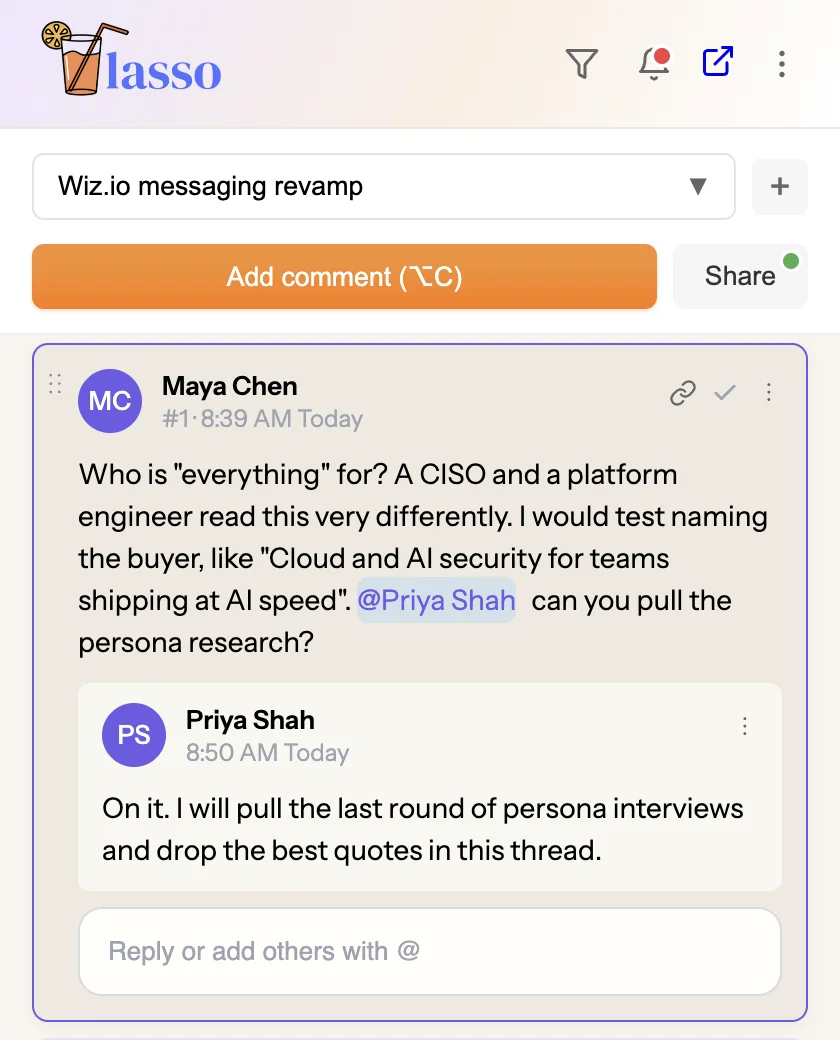
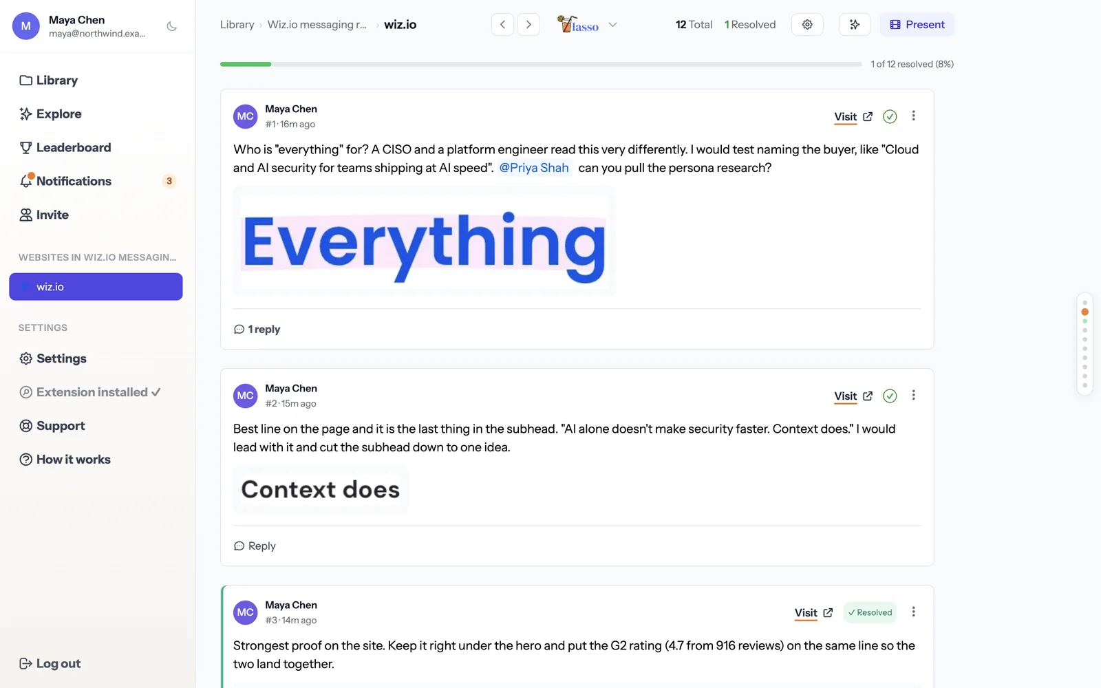
The headline reads "Protect Everything You Build and Run". It's confident, but it answers question two without touching question one. A CISO, a platform engineer and a developer will all read "everything" differently, and none of them is named. My first note suggested naming the buyer and testing a line like "Cloud and AI security for teams shipping at AI speed". I tagged Priya so she could bring the persona research into the same thread.
The second note is my favorite kind of find. The best line on the page is the last sentence of the subhead. "AI alone doesn't make security faster. Context does." That's a real point of view, it's short, and it explains why Wiz is different. It's buried at the end of a long paragraph. I'd promote it to the headline or right under it, and cut the subhead down to one idea.
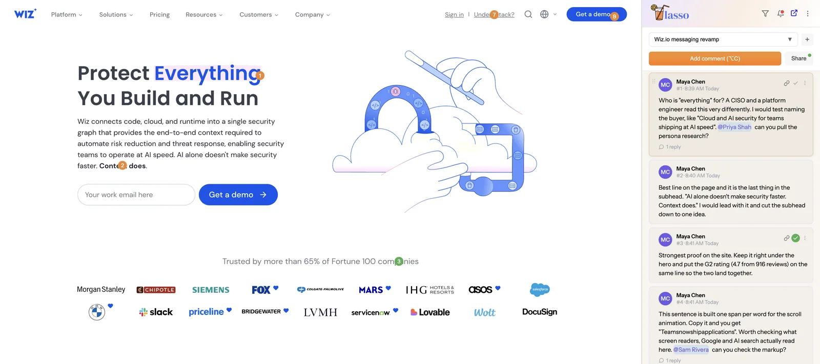
Notice the pins are numbered on the page and in the side panel. When someone says "look at three", everyone's looking at the same thing.
Proof, and what to keep
An audit that's only criticism is hard to trust, and it also tells the team nothing about what to protect in the revamp. So I always leave "keep this" notes too.
The proof line under the hero, "Trusted by more than 65% of Fortune 100 companies", is the strongest claim on the site. Keep it right under the hero. The G2 rating (4.7 from 916 reviews) sits much further down the homepage. I'd pull it up onto the same line so the two land together. We marked that one resolved straight away, since it's a decision, not a task. It shows as a green pin.
Further down, the agent tabs pair each feature with a named customer quote. That's exactly right. A specific quote next to the claim it proves does more work than the long wall of reviews near the bottom of the page.
That quote sits a few thousand pixels down, which is where the panel earns its keep. Click the note in the side panel and the page scrolls to it and outlines the element, so nobody has to hunt.
The product story
Two notes here, one on messaging and one on hygiene.
Wiz describes its three AI agents by colour. Red, Blue and Green are easy to remember. The cards list them Green, Red, Blue, and the tabs just below go Red, Blue, Green. It's a small thing, but small things add up when people are trying to learn new names. Pick one order, and lead each one with the job it does before the name.
The hygiene find was a sentence that animates in word by word. Each word is its own element, and when you copy the text you get "Teamsnowshipapplications" with no spaces. People see it fine. What screen readers, Google and AI search engines read is a fair question, so I tagged Sam to check the markup. Sam replied in the thread to confirm it and will run it through VoiceOver.
The consistency pass
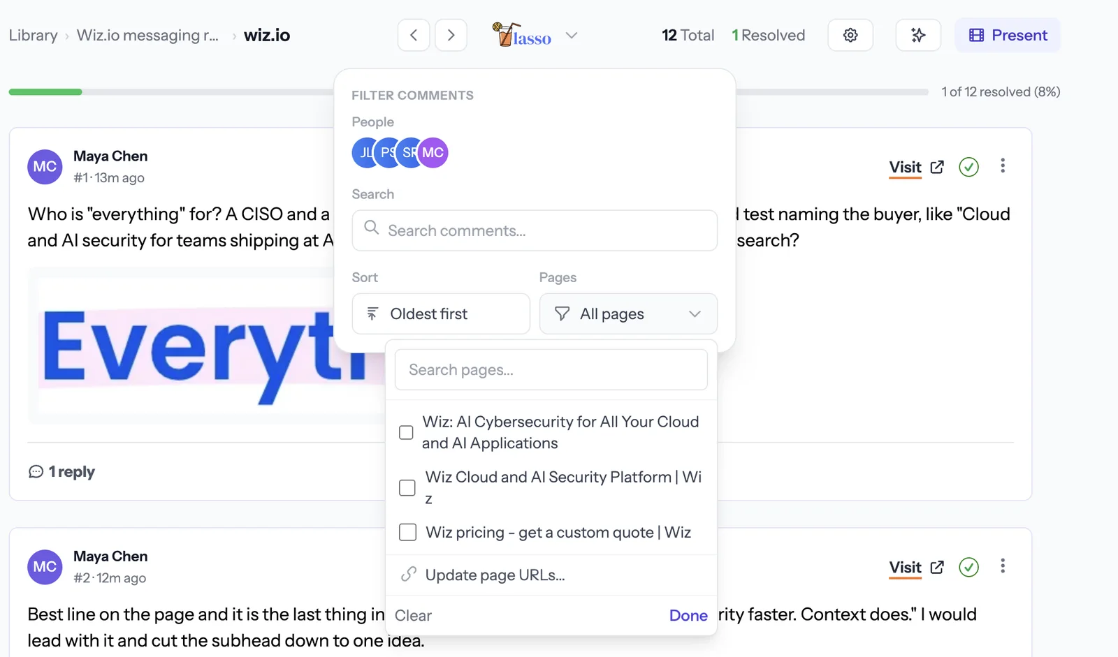
This is where a tool that groups notes by page helps the most. The homepage says "Protect everything you build and run". The browser tab says "AI Cybersecurity for All Your Cloud and AI Applications". The platform page says "Your cloud & AI security HQ". That's three ways of saying the same thing, and a buyer who visits all three pages has to work out whether they're the same product.
You can see it at a glance in the Lasso web app. The pages filter lists every page we commented on by its title.
I tagged Jordan on this one, and the reply was the useful part. Sales already uses "cloud and AI security" on calls, so that's the line to test, and Jordan will check what the last two campaigns used. A decision like that would normally happen in a Slack thread nobody can find later. Here it sits on the page it's about.
The platform page also introduces a new category name, "AI-APP". The only place it's spelled out is a resource card near the footer. Someone who knows the older CNAPP category will wonder if it's the same thing. When you create a category, define it once, early, in plain words.
The pages that ask for money
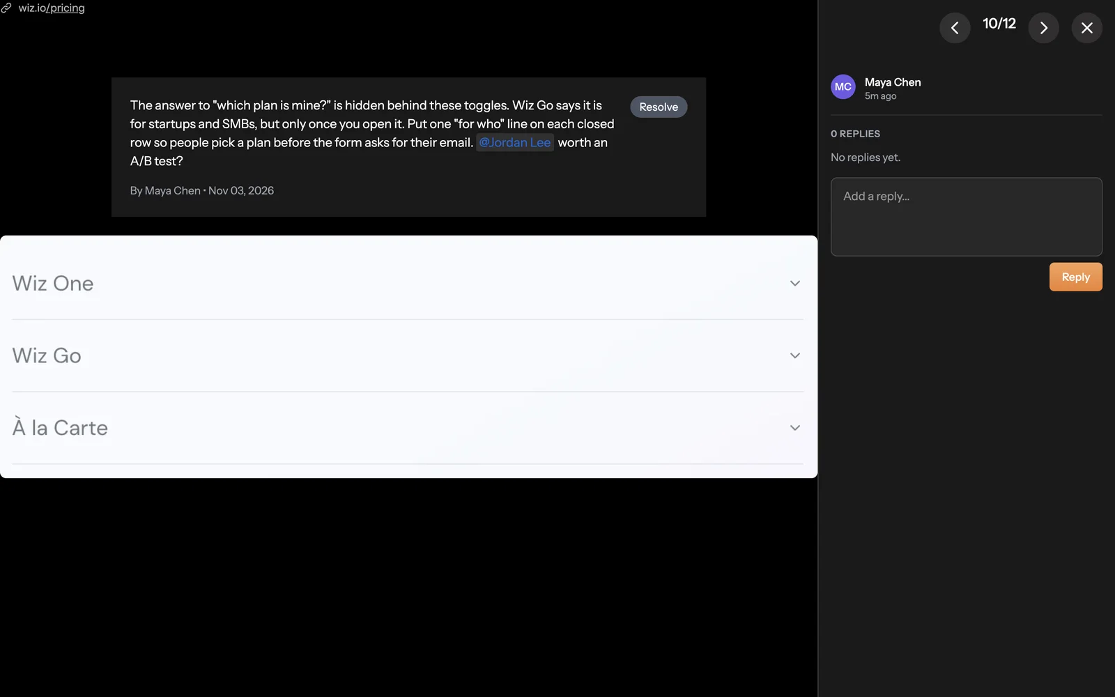
On pricing, Wiz shows three plans, Wiz One, Wiz Go and À la Carte, each behind a toggle. The answer to "which plan is mine?" is inside the toggles. Wiz Go says it's built for startups and SMBs, but only once you open it, and the form on the right asks for your email first. One "who it's for" line on each closed row would let people pick themselves before the form.
This one wasn't about a single element, so I dragged a box over the whole plan list instead of clicking one item. Region pins are handy for layout notes like this.
Then the calls to action, which is question five. Every main button on the homepage asks for a demo. That's fine for someone ready to talk to sales and a lot to ask of someone who's curious. The platform page already has a lighter option, "Take the guided tour of Wiz", which I'd test on the homepage hero as well. And one thing Wiz does really well is the "Under attack?" link in the top bar. Someone in the middle of an incident is the most motivated visitor the site will ever get, and that link gives them a way in that isn't a demo form.
Sharing it with the team
Every comment in Lasso has its own link, which we call a super link. Paste it into Slack or an email and it opens the live page, scrolled to that exact spot, with every note on it pinned in place. No "which page was that on?"
For the review meeting itself, Present turns the collection into slides, one comment per slide, with the screenshot and the thread next to it. You can reply and resolve as you go, so the meeting ends with decisions instead of a list of things to discuss again.
And the web app shows the whole collection in one list, with a progress bar for how many notes are resolved.
Each note in the web app has a Visit button too. Hit it and Lasso opens the live page with the side panel already showing that collection, then scrolls down to the exact spot. Handy when the person fixing the copy wasn't in the review.
Turning twelve notes into a revamp brief
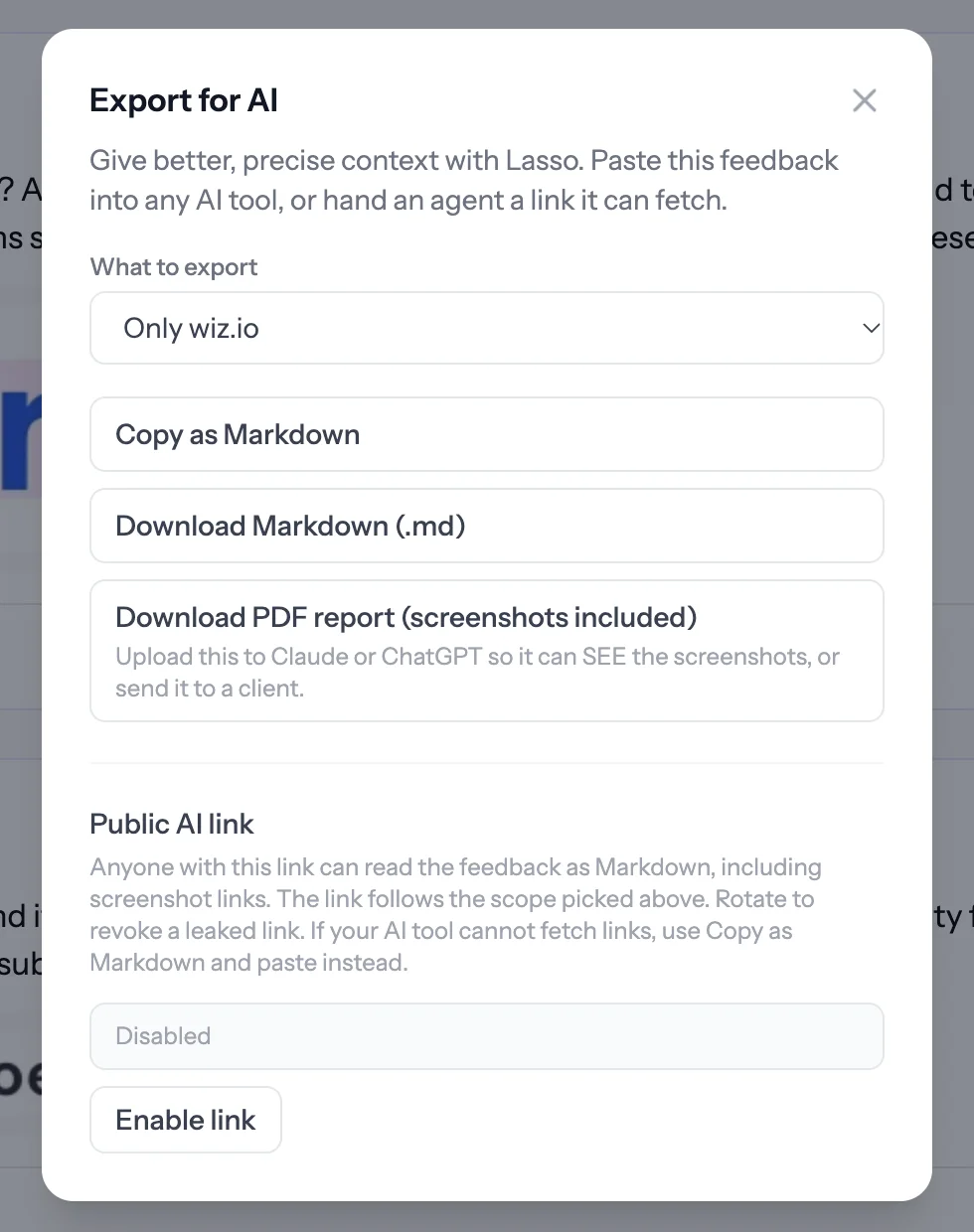
This is the step that normally takes an afternoon. I used Export for AI to copy the whole collection as Markdown. The file includes every comment, the page it was on, the element and its text, the screenshot and the replies, plus a short guide that tells the AI how to read it.
Then I pasted it into Claude with this prompt.
This is website feedback from my team on wiz.io, exported from Lasso.
Act as a senior product marketer. Group the open comments into themes,
rank them by likely impact on demo requests, and write a one page revamp
brief. Include a new hero (headline, subhead and two calls to action),
what to keep, the first three tests to run and how to measure each one.
Treat resolved items as decisions already made.
Here's a trimmed version of what came back.
Themes, by impact
- Positioning is split three ways across the site (#1, #7, #8)
- Only one path forward for visitors who aren't ready for sales (#9, #12)
- Pricing makes visitors pick a plan blind (#10)
- Small consistency and accessibility issues (#4, #5)
New hero, version to test
- Headline. Cloud and AI security, with the context to act on it.
- Subhead. AI alone doesn't make security faster. Context does. Wiz connects code, cloud and runtime so your team fixes what's actually exploitable.
- Calls to action. Get a demo, and Take the guided tour.
Keep
- The Fortune 100 proof line under the hero, with the G2 rating added (#3, resolved).
- The customer quote on each agent card (#6).
- The "Under attack?" link (#11).
First three tests
- Hero headline, current versus the version above. Measure demo requests per visitor.
- Guided tour as a second CTA in the hero. Measure tour starts, and demo requests from tour visitors within 30 days.
- One "who it's for" line on each closed pricing row. Measure pricing form completion.
Is it perfect? No. I'd argue with the headline, and a real team would want to check the tests against their own traffic. But it's a solid first draft in a minute, and it's built from notes the team actually agreed on, not from an AI skimming the homepage. If you need to share it outside the team, the PDF report has every screenshot built in, so you can attach it to an email or hand it to a ChatGPT project that needs to see the images.
What to steal for your own site
You don't need to be auditing Wiz to use any of this. Here's the short version.
- Ask the five questions of every section. Who, what, proof, why us, next step.
- Leave "keep this" notes. They protect what works during the revamp.
- Do a consistency pass. Your positioning line, category name and plan names should match on every page and in the page titles.
- Do a hygiene pass. Copy your animated text, check your tabs and toggles, and read the page the way a screen reader would.
- Give every level of intent a next step, not only the demo.
- Keep the notes on the page, tag the person who can answer, and let the decision live in the thread.
- When you're done, export the lot to AI and get the brief in a minute instead of an afternoon.
- If the consistency pass shows the positioning itself is fuzzy, fix that first. Our free messaging framework builder gets you a positioning statement and three pillars to check every page against.
If you want to run this on your own site, Lasso is free to start. Make a collection, invite your team, and start clicking. Next week it's another well known site. Teardowns from a designer's point of view are coming too.